You’ve watched these movies a hundred times each. Perhaps you watched the second one a few more times than that. But as you watched, did you notice that the bridge of the Enterprise changed each time Captain Kirk sat down in his chair? There are a few reasons for this.
To backtrack a bit, the Enterprise’s bridge was perhaps the most essential set for the entire series of films. It was the place where Kirk, Spock, McCoy, and the others could belt out their lines and size up the enemy. It was where Kirk outsmarted Khan and where the Klingons heard a computer voice counting.
From the start, the redesign of the Enterprise bridge was complicated. Though the Original Series’s bridge would not work with high-quality film cameras, it was redesigned in parts. Starting first with the initial design for Star Trek: Phase II, the bridge was modernized by designer Mike Minor. When Phase II morphed into The Motion Picture (TMP), these changes were made even more significant by production designer Harold Michelson.
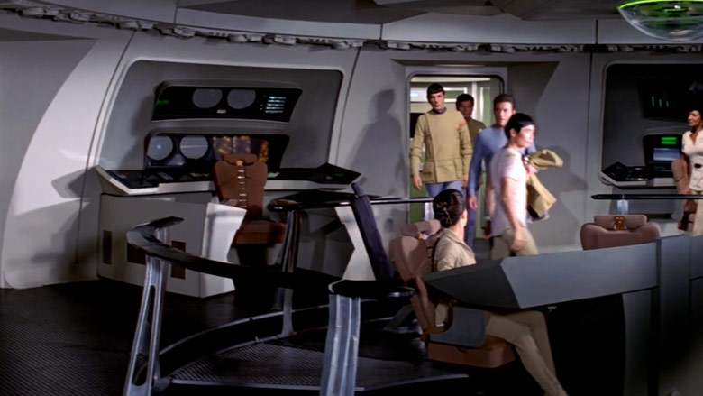
ParamountThe Motion Picture bridge
The bridge for TMP was almost colorless — some would say that this reflected the film’s soul as well. Gone were the bright primary colors from TOS, replaced with steel grays and light blues.
“I think the concept was a very 2001 approach,” Leonard Nimoy told author Jeanne Kalogridis in her book, “Star Trek: Where No One Has Gone Before – A History In Pictures.” “[It was] very cool. Very scientific. Steely gray. A very metallic film.”
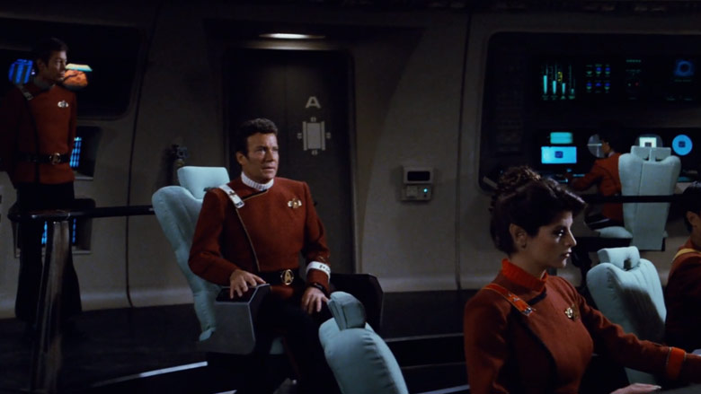
ParamountThe Wrath of Khan bridge
For the sequel, Director Nicholas Meyer had the bridge repainted. Under the direction of Minor and set decorator Charles M. Graffeo, there were more colors now for fans to look at. Instead of gray and blue, we saw sandy-brown, black, and light blues. It helped that the crew themselves were decked out in the colorful “monster maroon” red uniforms. They also removed an entire station behind the captain’s chair.
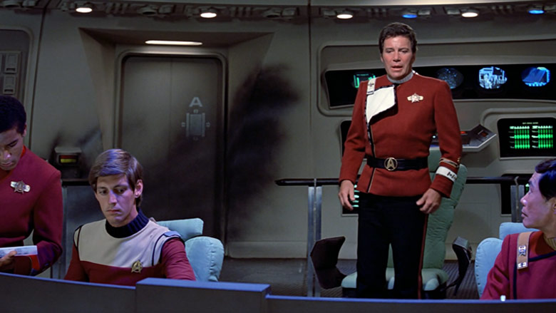
ParamountThe Search for Spock bridge
In Star Trek III, the bridge largely remained unchanged unless you count the scarring leftover from their battle with Khan. Keen eyes will see slight variations on the bridge from the end of Wrath of Khan to the start of Search for Spock. Art Director John E. Chilberg II made a few changes with displays and monitors, which were updated. Some of the wall “gadgets” and ornamentation also changed.
Before you say, “there was no bridge in Star Trek IV,” you’re almost right. Since the Enterprise was destroyed in Star Trek III, the crew took over the Klingon vessel. When they got back from saving the world (by delivering whales from the 20th Century), they got a new Enterprise. This ship was supposed to be the Yorktown, but Starfleet renamed it the Enterprise-A. So our heroes got their old ship back — sort of.
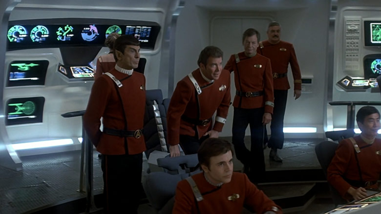
ParamountThe Voyage Home bridge
As you can see, the bridge of the Enterprise-A is entirely different from the Enterprise-refit. It was whiter, brighter, and had more colorful displays and lights throughout. It’s almost reminiscent of the J.J. Abrams Star Trek series bridge, which was the work of Keith P. Cunningham and his team.
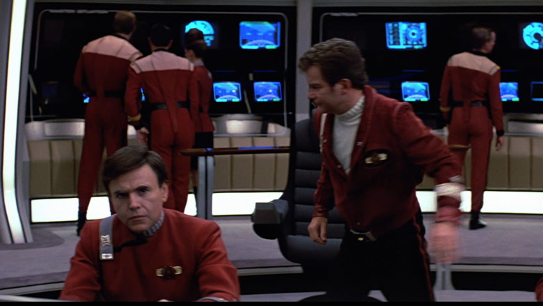
ParamountThe Final Frontier’s bridge
One might think that the Enterprise-A, fresh out of spacedock, would not need additional changes. Shouldn’t it be ready for action as-is? This was not the case, as the look of the bridge changed yet again. This time, the team under art director Nilo Rodis-Jamero added padding in interesting places. The set got a more tan color throughout. These changes were acknowledged in the film, as Kirk complained about missing his old chair.
For their final journey on the Enterprise-A, the crew got a wholly new look. For Star Trek IV: The Undiscovered Country, this came full circle, and Rodis-Jamero’s new-look bridge was quite different. Unlike the “steel” look in TMP, this bridge looked as if it were actually made of steel. Stainless steel, perhaps. The rest of the bridge was darkly colored, which allowed for the displays and screens to earn a lot of attention. The padding behind the captain’s chair was now burgundy, a change from the tan in the previous film.
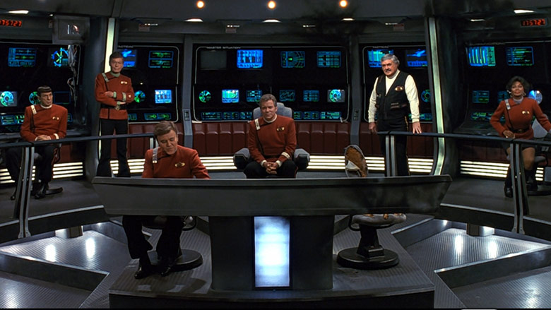
ParamountThe bridge in The Undiscovered Country
The Answer Revealed
Why were the bridges different on a ship that was supposed to be (mostly) the same from picture to picture? There are actually two correct answers. The first was that the budget for these films was small. Producer Harve Bennett was called in by Paramount to create movies on a TV budget after TMP budget nearly wiped out any box office earnings.
One of the ways Bennett did this was by “redressing” the bridge for different roles. This meant that the Enterprise and Excelsior bridge (in both Star Trek III and IV) were virtually identical. They were the same, exact set but changed around a little to ensure that fans would not think they were looking at the same stage twice. But, since they were part of “one happy fleet,” they ought to look similar. This meant that after each redress, things were different.
But the interesting reason (which also works with canon) is that the bridge was designed to be replaced at regular intervals. According to the “Star Trek: The Next Generation – Technical Manual,” Rick Steinbach and Michael Okuda wrote that this idea originated during Star Trek V.
As the duo worked alongside Herman Zimmerman on the sets, the three agreed that the bridge was a “plug-and-play module designed for easy replacement.” They theorized that this easily changeable unit would allow for “control systems to be upgraded, thereby extending the useful lifetime of a starship.”
They noted that this would also help explain the differences in the four Miranda-class ships filmed — the Reliant, the Saratoga, the Lantree, and the Brattain. They all had wildly different bridges but were the same class vessel.
READ NEXT: On ‘Star Trek,’ Why Didn’t They Just Replicate Starships?


No comments:
Post a Comment